5 Facebook Ad Examples That Crush It (And Why They Work)
Look, I get it. You're sick of throwing money at Facebook ads that perform about as well as a wet paper towel. Been there, done that.
The real secret? Ads that actually make people stop, pay attention, and take action.
Forget outdated strategies. Winning ads are all about understanding what makes people tick, crafting eye-catching creatives, and constantly testing what works.
So, let’s break down five Facebook ad examples that are making brands serious money, and more importantly, why they work so you can copy (err… draw inspiration from) them.

1. Before & After Ad – Hims Hair Regrowth
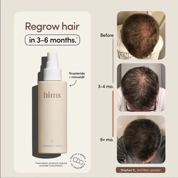
Ad Type: Before & After Transformation Ad
Why It Works: Proof + Visual Impact = Instant Credibility
Hims nails the before-and-after game by showing a real customer’s hair regrowth journey over 3-6 months. People love a transformation story, and nothing says “this works” like actual results.
Key Takeaways:
- Show real results – Straight to the point, just proof.
- Set expectations – A clear timeline builds trust.
- Minimal distractions – Let the visuals do the heavy lifting.
✅ Pro Tip: If you sell anything that improves appearance or performance, before-and-after formats are gold. Use them.
2. The Scroll-Stopping Video – Dr. Squatch
Ad Type: Video Ad
Why It Works: Humor + Surprise = Instant Attention
Dr. Squatch’s video ad is a masterclass in keeping eyeballs glued. The mix of bold humor, fast-paced storytelling, and punchy visuals makes it nearly impossible to ignore.
Key Takeaways:
- Use humor to stand out – Funny ads get shared and remembered.
- Fast cuts keep attention – No dead air, no wasted time.
- Curiosity hooks people – The first few seconds need to grab.
✅ Pro Tip: If humor fits your brand, double down on it. Funny ads break through the noise.
3. Strong Copy Ad – Huel Meal Replacement
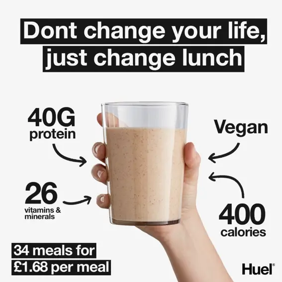
Ad Type: Text-Driven Ad
Why It Works: Simple, Conversational, and Straight to the Point
Huel’s ad doesn’t overcomplicate. The line “Don’t change your life, just change lunch” speaks directly to busy people who want healthier meals but aren’t ready for a full diet overhaul.
Key Takeaways:
- Big, bold hook – Make your first line hit hard.
- Numbers add credibility – 40g protein, 26 vitamins? Sold.
- Short copy wins – No distractions.
✅ Pro Tip: If your product has clear benefits, spell them out in a no-nonsense way. Less is more.
4. Comparison Ad – Rheal Plant Collagen vs. Bovine Collagen
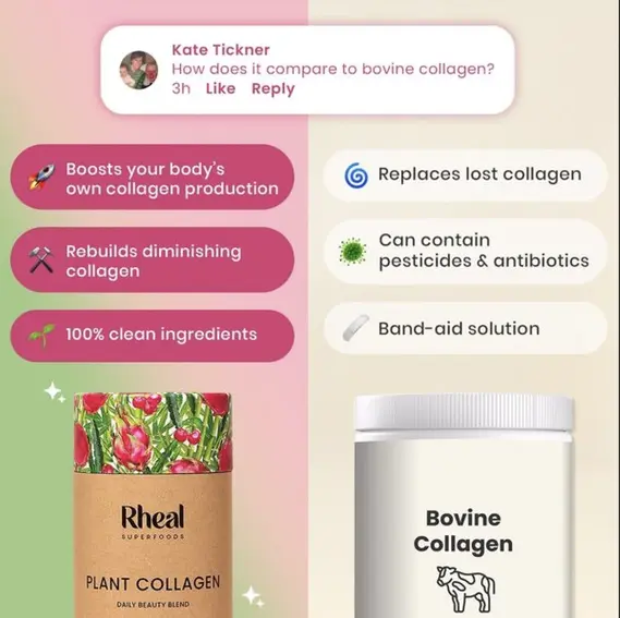
Ad Type: Side-by-Side Comparison
Why It Works: Quick Contrast = Faster Decisions
Rheal’s ad puts plant collagen head-to-head with bovine collagen, making it dead simple for customers to see why their product is the better pick.
Key Takeaways:
- Make choices obvious – Guide the decision-making process.
- Subtly highlight competitors’ flaws – No need to be aggressive.
- Color coding helps – Positive benefits pop, negatives fade.
✅ Pro Tip: If your product is better than the competition, don’t just say it - show it in a side-by-side breakdown.
5. Product-Focused Ad – AG1 Morning Scoop
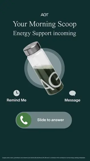
Ad Type: Product-Centric Ad
Why It Works: Familiarity + Simplicity = Instant Appeal
AG1’s ad brilliantly mimics a phone call notification, instantly grabbing attention. The design is sleek, and the message is crystal clear - this is your morning routine, simplified.
Key Takeaways:
- Make it feel personal – The phone call format makes the ad feel like it’s speaking directly to you.
- Minimalist design works – A clean, dark background with a single, compelling visual keeps the focus on the product.
- Subtle but strong CTA – The ‘slide to answer’ prompt is a genius way to nudge action without being pushy.
✅ Pro Tip: If your pricing is a selling point, put it front and center. People love a deal.
Facebook Ad Best Practices That Work Every Time
Before you go launching your next campaign, don’t skip these:
- ✅ One idea per ad – Don’t confuse people with multiple messages.
- ✅ High-quality visuals – Bad design = wasted budget.
- ✅ Hook them fast – You have 3 seconds to make them stop scrolling.
- ✅ Mobile-first always – 90% of users browse on their phones.
- ✅ Test, test, test – Winning ads aren’t guessed, they’re refined.
Final Thoughts: Make Ads That Don’t Suck (please)
Most Facebook ads are forgettable. Yours don’t have to be. Winning ads are:
- Dialed into the audience (Know them better than they know themselves.)
- Constantly tested (If you’re not iterating, you’re losing.)
- Creative and bold (Playing it safe is a death sentence.)
At the end of the day, the best ad is the one that sells. Everything else? Just noise.
So - what ad format are you testing first? Drop a comment below (I read all comments).
Experience stress-free
advertising today.
We simplify the rules and give you actionable steps to
make your ads compliant.